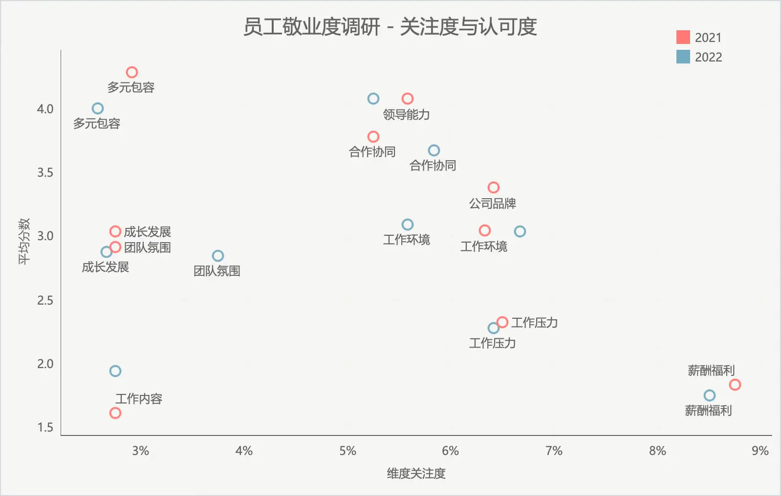
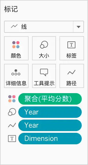
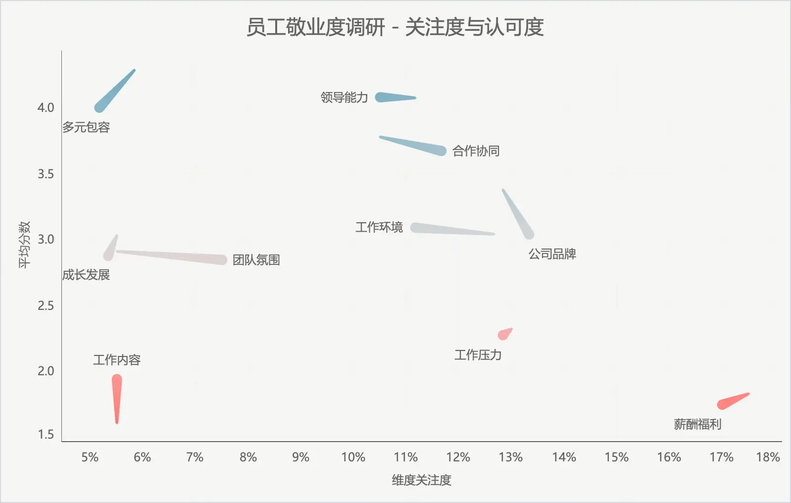
import pandas as pd
import numpy as np

employee_ids = [f"E{str(i).zfill(4)}" for i in range(1, 201)]
dimensions = ["薪酬福利", "工作环境", "成长发展", "合作协同", "团队氛围", "领导能力", "工作压力", "公司品牌", "工作内容", "多元包容"]
probabilities = np.random.uniform(0.05, 0.45, len(dimensions))
probabilities /= probabilities.sum()
adjusted_means = np.array([1, 3, 3, 4, 3, 5, 2, 3, 1, 5])
departments = ["财务部", "人力资源部", "市场部", "技术部", "销售部", "客服部", "研发部", "行政部"]

def generate_scores(dimension, mean_score):
    score = np.random.normal(mean_score, 2)
    score = np.clip(round(score), 1, 5)
    return score

def generate_survey_data_with_department_and_scores(year):
    records = []
    for emp_id in employee_ids:
        chosen_dims = np.random.choice(dimensions, size=3, replace=False, p=probabilities)

        department = np.random.choice(departments)
        for dim in chosen_dims:
            index = dimensions.index(dim)
            mean_score = adjusted_means[index]  # Use the adjusted mean for this dimension
            score = generate_scores(dim, mean_score)
            records.append([emp_id, dim, score, year, department])
    return records

records_2021 = generate_survey_data_with_department_and_scores(2021)
records_2022 = generate_survey_data_with_department_and_scores(2022)

all_records = records_2021 + records_2022

df_survey_results = pd.DataFrame(all_records, columns=["Employee ID", "Dimension", "Score", "Year", "Department"])

df_survey_results.to_csv("employee_survey_results.csv", index=False)


